A simulation of epidemic spread in a network of students and courses
How fast can a virus spread among students at a university campus? Building on a previous post, I will try to answer this question by simulating spread of viral disease in a network of students and courses. While factors affecting epidemic spread are numerous, the point of this post is simply to show that there is readily available information about the ecology of universities that can be parsed and put to use for modeling purposes. As scholars of education, we know little or nothing about epidemiology or virology. But we know something about education and its organization, and we can use that something to facilitate epidemiological forecasts for our particular part of society.
This simulation is based on a range of wild assumptions, some of which lead to overestimation while others lead to underestimation of epidemic spread on campus:
- All students go to class and meet regularly. They probably meet regularly, but not necessarily in class. This assumption might overestimate spread.
- Being in class for one week is a sufficient condition for contracting a disease (on average, students receive 11 hours of face-to-face instruction a week according to a recent report). This assumption might overestimate spread.
- Students who contract a disease will continue to go to class and infect additional students. They probably won’t, and this assumption might overestimate spread.
- Among the students, only patient 0 can contract disease outside class. Not true at all. This assumption will underestimate spread.
- Students who take multiple courses take them simultaneously. This is for the most part not true, since most course modules are arranged sequentially. This assumption might overestimate spread.
- Students do not infect others during the incubation period. This is probably not true, and this assumption might underestimate spread.
- Faculty are not part of the model. In real life, they most certainly are. This assumption might underestimate spread.
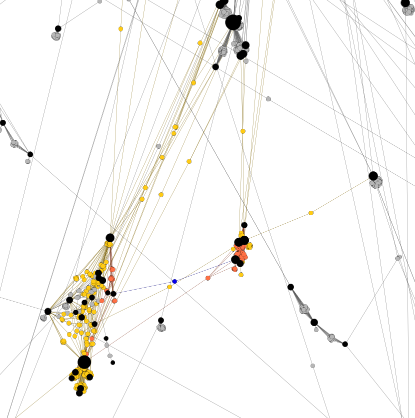
Before I show the results of the simulation, let’s have a look at how this model works by using a simple example and a visualization of the network depicted in Figure 1. In this network, students are represented by grey dots and courses by black dots, and lines are drawn to show in which courses students are enrolled. Patient 0, the blue dot, is enrolled in two courses. During the first week, patient 0 could infect all of their classmates who are represented as orange dots in Figure 1. The orange classmates then go on, in week 2, and spread the disease to all their classmates, who are represented as yellow dots. And so on.
Figure 1. An example of a student-to-course network with students (grey), courses (black), patient 0 (blue), week 1 infected classmates (orange), and week 2 infected classmates (yellow).
Since the amount of spread in this network model is contingent upon who will be the designated patient 0, it seems reasonable to run simulations where patient 0 is randomly drawn from the entire population of students. Figure 2 shows the distributions of the share of infected students after running 10,000 simulations for week 1, 2 and 3 respectively. After one week, the mean of the simulations suggest that 0.3 percent of students would have been infected. This number rises to 4.7% after two weeks, and 22.5% after three weeks. In other words, just over one fifth of the student population at this university would be infected after three weeks, according to this model with its wild assumptions.
Figure 2. 10,000 simulations of epidemic spread among students at a university campus, starting from a pseudo-randomly selected patient 0.
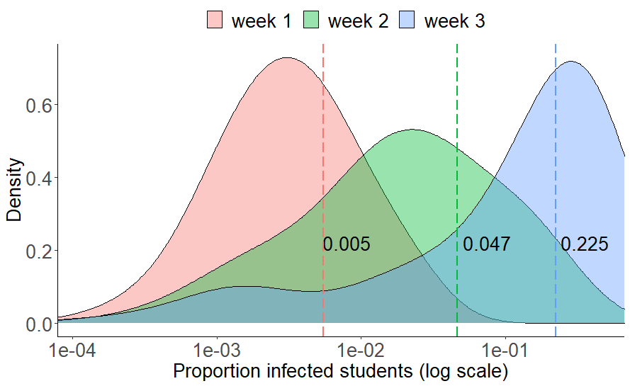
At this point, it should be noted that the means of the simulations resemble the neighborhood statistics (proportion reachable in k steps) from a previous post, simply because the mean of random samples of patient 0s will naturally approach the population mean (the overall proportion of students reachable in k steps). The added value of running the simulations is that we obtain a distribution around the mean that hopefully highlights that there is a range of possible outcomes that are either better or worse than what we might expect from looking at the mean alone.
It is difficult to fully determine whether the spread simulated here is fast or slow in itself. However, since the results of these simulations map pretty well to the neighborhood statistics, we can compare with the same statistics from Weeden & Cornwell (2020) and conclude that although 22.5% in three weeks might seem fast, it is definitely not as fast as the 92.1% estimated for Cornell.
Like any model, this one is wrong. In its current definition, it might not even be useful. But it has three main benefits that should make it easy to become useful: it is simple, more reasonable and useful assumptions can be accommodated, and it is built on empirical data of a “real” network.